Partial Data Regression Line in Google Sheets
Published: 2025-10-10 1:48 PM
Category: Science | Tags: data, google sheets, enthalpy, analysis, graph, chemistry
Excuse the crummy title. I ran into an interesting graphing problem in Google Sheets that I'm documenting here for anyone else who might have the same question or problem.
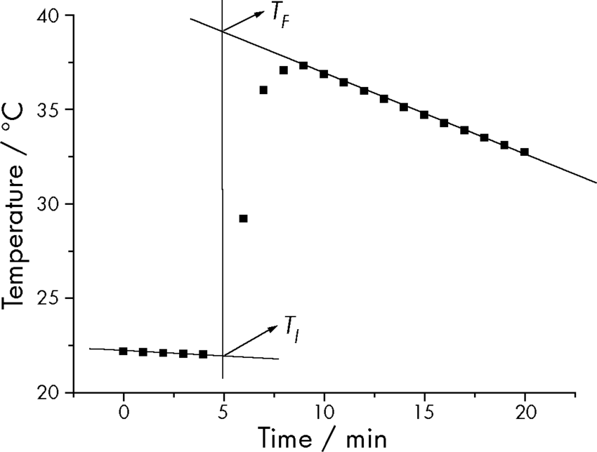
We're finishing up a unit on thermochemistry and we're capping it off with a lab where students decompose hydrogen peroxide with an iron nitrate catalyst and measuring temperature change. They collect data for about 20 minutes and then use their data to calculate the enthalpy change for the system. I'm basing this on a procedure from Charles Marzzacco published in the Journal of Chemical Education. His procedure includes a graph of his trial data:
I wanted my students to some more analysis with this lab, so we're going to make the same graph to estimate the maximum temperature of the system following the addition of the catalyst. I'll give me a chance to talk about trends in data, what linear regression does for us, and then calculate their results. The problem is that this kind of regression is not easy to do in Google Sheets. It took some creative use of duplicated data, help from Tom Woodward, and some questionable personal choices.
Here's the graph I ended up with:
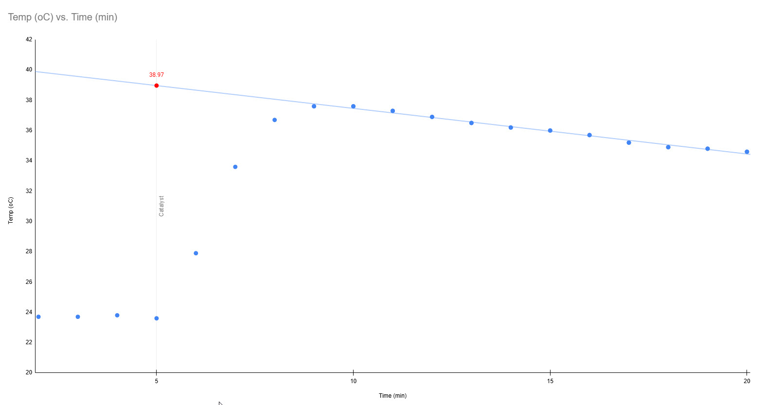
This worked by duplicating a subset of data in the source sheet. The original data is the main graph, recorded like normal. A trendline can be added, but it looks at the entire dataset where I only wanted the best fit from the highest temperature to the end of the run. Tom suggested using a QUERY function to copy data past time n to plot another series on top of the full run.
=QUERY(A1:B20, "Select A, B WHERE A >= 8", 0)
My higest temperature was a time 8, so the formula grabs every temperature past that time. This formula has to go in the next column over on the same row as your target temperature. This will add another series to the chart that can be formatted the same as the main line so it is invisible to the user. In the chart editor, this series can have a trendline added to show the trend for the subset.
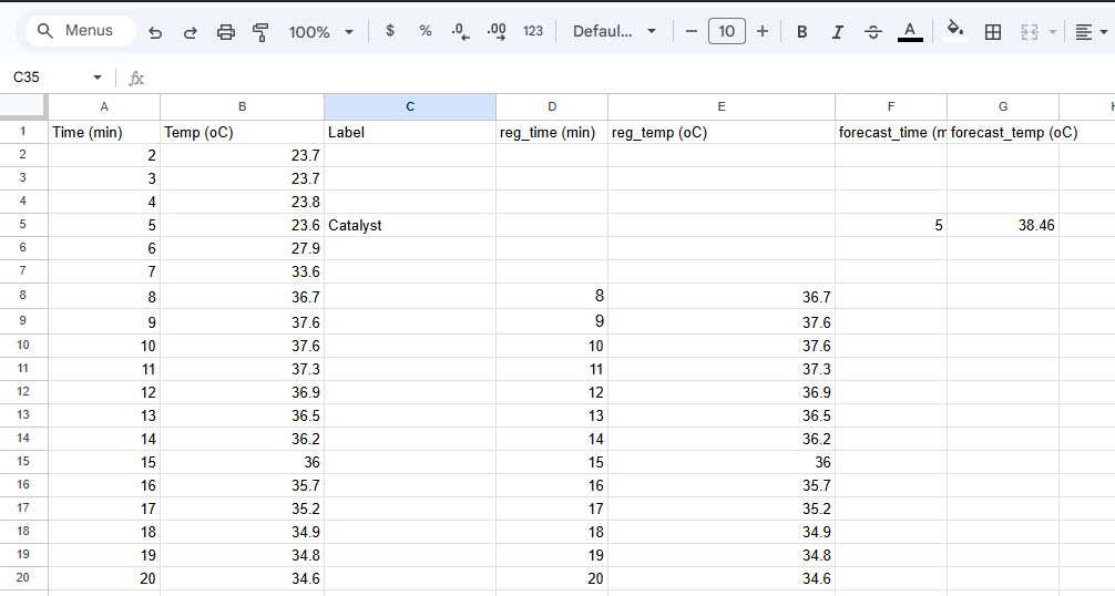
Finally, I used Sheets' FORECAST function to give it the subset of data to calculate the Y intercept at time n. The formula in this case was:
=FORECAST(5, E8:E20,D8:D20)
This goes on line 5 of a third pair of columns to be graphed as a third series as the intercept of the vertical line at time=5 and the regression line. Here's what the sheet itself looks like:
It works, but it's kind of a pain. I'm going to have students graph this one by hand and maybe next time, we'll build some more spreadsheet wrestling time in.
Comments