Managing Class Data in Google Sheets
Published: 2024-03-12 10:05 AM
Category: Science | Tags: teaching, data, chemistry, spreadsheet, functions, tricks
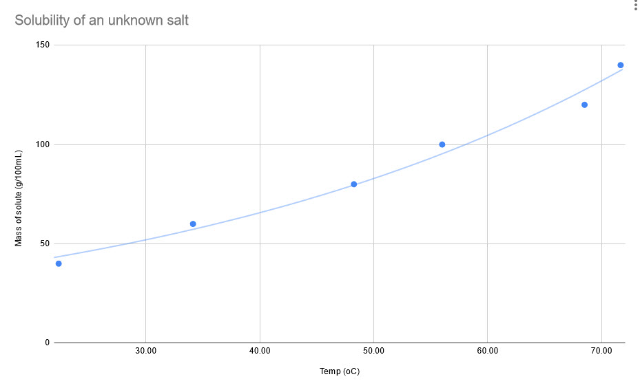
In chemistry, I have students create a solubility curve for an unknown salt to demonstrate how temperature affects solubility of materials. The protocol has them create six solutions of varying concentrations and then they plot their data and compare it to an unknown. For first year chemistry, this is a lot to organize and complete successfully as a group. So, to make it simpler, I assign each lab station a mass and they do repeated trials of that mass to determine the saturated temperature.
For more accurate results, I combine all of my class data into one sheet which can then be analyzed by students. This little spreadsheet trick can help you get data which is grouped by a value (mass, in this case) and then averaged for a final data set. This should work for any data where you have repeat values. Here's a sample sheet (student names removed):
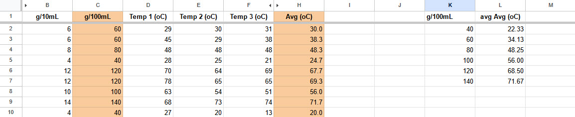
Students complete the data in the white cells and their row is automatically averaged. Once the sheet is full, I want to know the average temperature for all masses which are the same. You could sort the sheet by mass manually and then average each mass individually, but the sheets QUERY function can do that for us in one line.
QUERY is one of the harder functions to learn, but once you do, you'll see potential for it everywhere. In this sample, cell K1 has the following function:
=QUERY(B1:H10, "Select C, AVG(H) where H<>0 group by C")
Breaking this down, QUERY will:
- Get your entire data range. This should be the raw data
- Get column C and group results together by value (all the 60s together, the 120s together, etc)
- For each group, average the value in H if it is greater than 0
In this case, it returns a two-column table of mass per 100mL (column C) grouped by value with the temperature averaged for all masses in that group. Now, I can create a chart showing the solubility results for this class data:
Comments