Ogallala Aquifer Lesson Resources
Published: 2024-01-19 3:15 PM | Updated: 2024-01-23 8:32 AM
Category: Science | Tags: lesson, resources, environmental science, case study, water
We're wrapping up a case study on the Ogallala Aquifer this week and I'm happy with the kind of exploration students have been able to do. Original credit for the base materials go to my sister-in-law who graciously shared all of her environmental science materials with me once I found out I would be teaching it for the first time this year.
The Prelude
Students took some time to define the difference between groundwater and surface water. We did a large watershed mapping exercise (that will probably be another blog post) showing how water moves across different regions of the world downhill toward oceans. Then, we took some time to talk about freshwater uses before moving into discussing how areas without major rivers get freshwater resources.
The Aquifer
The Ogallala Aquifer is the largest freshwater deposit in the United States (175,000 sqaure miles in eight states). Starting in the mid 1900's, plains states farmers began pumping water from the aquifer as an irrigation source. I showed this short documentary as a discussion starter for the main portion of the exploration.
Expand and Explore
Following the video, I gave students a Google Doc template with expansion and exploration questions. Because environmental science overlaps science with human experience, these explorations look at the science behind what is happening as well as social, economic, and political implications. Students need to build their own understanding through research as they work to apply ideas and concepts to the scientific base.
This is also a great time to introduce data manipulation skills. The US Geological Survey publishes open-access data sources on all kinds of projects, one of which is the High Plains Water-Level Monitoring Study. This is field data for well depths which tap into the Ogallala Aquifer across all eight states. I grabbed the full TSV for 2013 from the published data page and then worked with students to create a scatter plot showing average well depth for each state that year. They then worked on some data analysis using their graphs.
The document linked below has two graphs already created, one showing the average depth to the water surface for each state as well as one showing the average water depth as well as the average well depth. I asked students to predict which state was most at risk of losing water first based on the water surface depth alone and, after some discussion, they realized that the aquifer might not be uniform depth. They also discussed topography differences which would make the water surface further into the crust. We then generated the second graph to show the average volume of water in each state which led to more thorough analysis.
Bigger Perspective
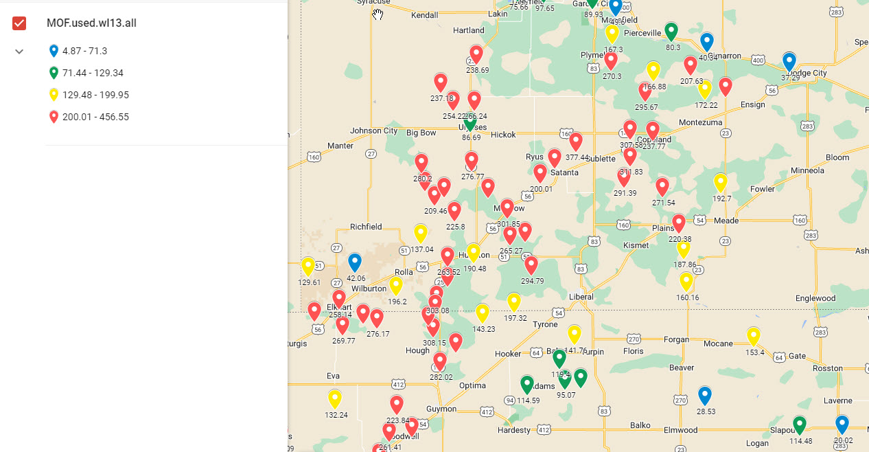
Data on charts is good for interpretation skills but I wanted them to be able to conceptualize each row on that sheet as an actual place with an actual well. Using the same USGS data, I threw together a custom Google Map and colored each marker in a range according to the depth of water below the surface of the ground (deeper wells are red).
The Endgame
We happen to live in an area rife with water thanks to the Great Lakes so we don't really think about water as a scarce commodity. We're finishing the unit with pollution and its effect on the Great Lakes' (sidebar: The Death and Life of the Great Lakes by Dan Eagen is wonderful and will probably appear in this unit soon) ecology and economy along with a reflection on their own personal water use habits. Some of my students come from farms with radial irrigation equipment, so I'm curious to see what connections come from this study.
Links
If you'd like copies of anything, you can get them here:
Comments